Components
OpenZeppelin UIKit ships two categories of components: UI primitives from @openzeppelin/ui-components and renderer widgets from @openzeppelin/ui-renderer. This page catalogs both and shows how to use them.
UI Primitives
@openzeppelin/ui-components provides foundational React components built on Radix UI and shadcn/ui patterns. All components are styled with Tailwind CSS and support dark mode.
General Components
| Component | Description |
|---|---|
Button / LoadingButton | Action buttons with multiple variants (default, destructive, outline, secondary, ghost, link) |
Input / Textarea | Text input primitives |
Label | Accessible form labels |
Card | Container with CardHeader, CardTitle, CardDescription, CardContent, CardFooter |
Dialog | Modal dialogs with DialogTrigger, DialogContent, DialogHeader, DialogFooter |
Alert | Alert messages with AlertTitle and AlertDescription |
Checkbox / RadioGroup | Selection inputs |
Select | Dropdown select with SelectTrigger, SelectContent, SelectItem |
DropdownMenu | Context menu with DropdownMenuTrigger, DropdownMenuContent, DropdownMenuItem |
Popover | Floating content anchored to a trigger element |
Progress | Progress bar indicator |
Tabs | Tab navigation with TabsList, TabsTrigger, TabsContent |
Tooltip | Hover tooltips |
Accordion | Collapsible content sections |
Banner | Full-width notification banners |
Calendar / DateRangePicker | Date selection and date-range picker components |
EmptyState | Placeholder UI for empty lists or initial states |
ExternalLink | Anchor that opens in a new tab with appropriate rel attributes |
Form | Form wrapper integrating react-hook-form with accessible error messages |
Header / Footer | Page-level header and footer layout components |
Sonner | Toast notification system (powered by sonner) |
Sidebar | Sidebar navigation layout |
Wizard | Multi-step wizard flow |
Blockchain-Specific Components
| Component | Description |
|---|---|
NetworkSelector | Searchable network dropdown with optional multi-select mode |
NetworkIcon | Network-specific icon (renders the correct logo for a given network ID) |
NetworkStatusBadge | Colored badge showing network status (e.g. connected, syncing) |
EcosystemDropdown | Ecosystem selection with chain icons |
EcosystemIcon | Chain-specific icons (Ethereum, Stellar, Polkadot, etc.) |
AddressDisplay | Formatted address with optional alias labels and edit controls |
ViewContractStateButton | Quick-action button to open the contract state widget |
OverflowMenu | Compact "..." dropdown for secondary actions |
Usage
import { Button, Card, CardContent, CardHeader, CardTitle } from '@openzeppelin/ui-components';

function ContractCard({ name, address }) {
  return (
    <Card>
      <CardHeader>
        <CardTitle>{name}</CardTitle>
      </CardHeader>
      <CardContent>
        <p className="text-sm text-muted-foreground">{address}</p>
        <Button variant="outline" className="mt-4">
          View Contract
        </Button>
      </CardContent>
    </Card>
  );
}
Form Fields
The field components are designed for use with react-hook-form. Each field handles its own validation, formatting, and blockchain-specific behavior.
| Field | Input Type | Use Case |
|---|---|---|
AddressField | Blockchain address | Contract addresses, recipient addresses; validates format per ecosystem |
AmountField | Token amounts | Token transfers; handles decimals and BigInt formatting |
BigIntField | Large integers | Raw uint256 values, timestamps, token IDs |
BytesField | Hex byte strings | Calldata, hashes, signatures |
TextField | Free-form text | String parameters, names, URIs |
UrlField | URL | Endpoint URLs, metadata URIs; validates URL format |
PasswordField | Masked text | API keys, secrets; input is hidden by default |
NumberField | Numeric values | Counts, percentages, indices |
BooleanField | True/false | Feature flags, approvals |
EnumField | Enum selection | Contract enum parameters |
SelectField | Dropdown | Predefined option lists |
SelectGroupedField | Grouped dropdown | Categorized options |
RadioField | Radio buttons | Small option sets |
TextAreaField | Multi-line text | ABI input, JSON data |
CodeEditorField | Code / JSON editor | Contract source code, ABI JSON, configuration files |
DateTimeField | Date and time | Timestamps, scheduling, time-locked parameters |
FileUploadField | File upload | Importing ABIs, uploading contract artifacts |
ArrayField | Dynamic arrays | Array parameters (e.g. address[], uint256[]) |
ArrayObjectField | Array of structs | Repeated struct entries (e.g. batch transfers, multi-recipient calls) |
MapField | Key-value pairs | Mapping-like structures |
ObjectField | Nested objects | Struct/tuple parameters |
Field Example
import { useForm } from 'react-hook-form';
import { AddressField, AmountField, Button } from '@openzeppelin/ui-components';

function TransferForm() {
  const { control, handleSubmit } = useForm({
    defaultValues: { to: '', amount: '' },
  });

  return (
    <form onSubmit={handleSubmit(onSubmit)} className="space-y-4">
      <AddressField
        name="to"
        label="Recipient"
        control={control}
        placeholder="0x..."
      />
      <AmountField
        name="amount"
        label="Amount"
        control={control}
        placeholder="0.0"
      />
      <Button type="submit">Transfer</Button>
    </form>
  );
}
Address Label & Suggestion Contexts
UIKit provides context-driven address resolution that works automatically with AddressField and AddressDisplay:
AddressLabelProvider: When mounted, allAddressDisplayinstances in the subtree auto-resolve human-readable labels (e.g. "Treasury Multisig" instead of0x1234...abcd).AddressSuggestionProvider: When mounted, allAddressFieldinstances show autocomplete suggestions as the user types.useAddressLabel(address, networkId?): Hook to resolve a label from the nearest provider.
Renderer Widgets
@openzeppelin/ui-renderer provides high-level, ready-to-use widgets for common blockchain UI patterns. These compose the lower-level components with adapter capabilities.
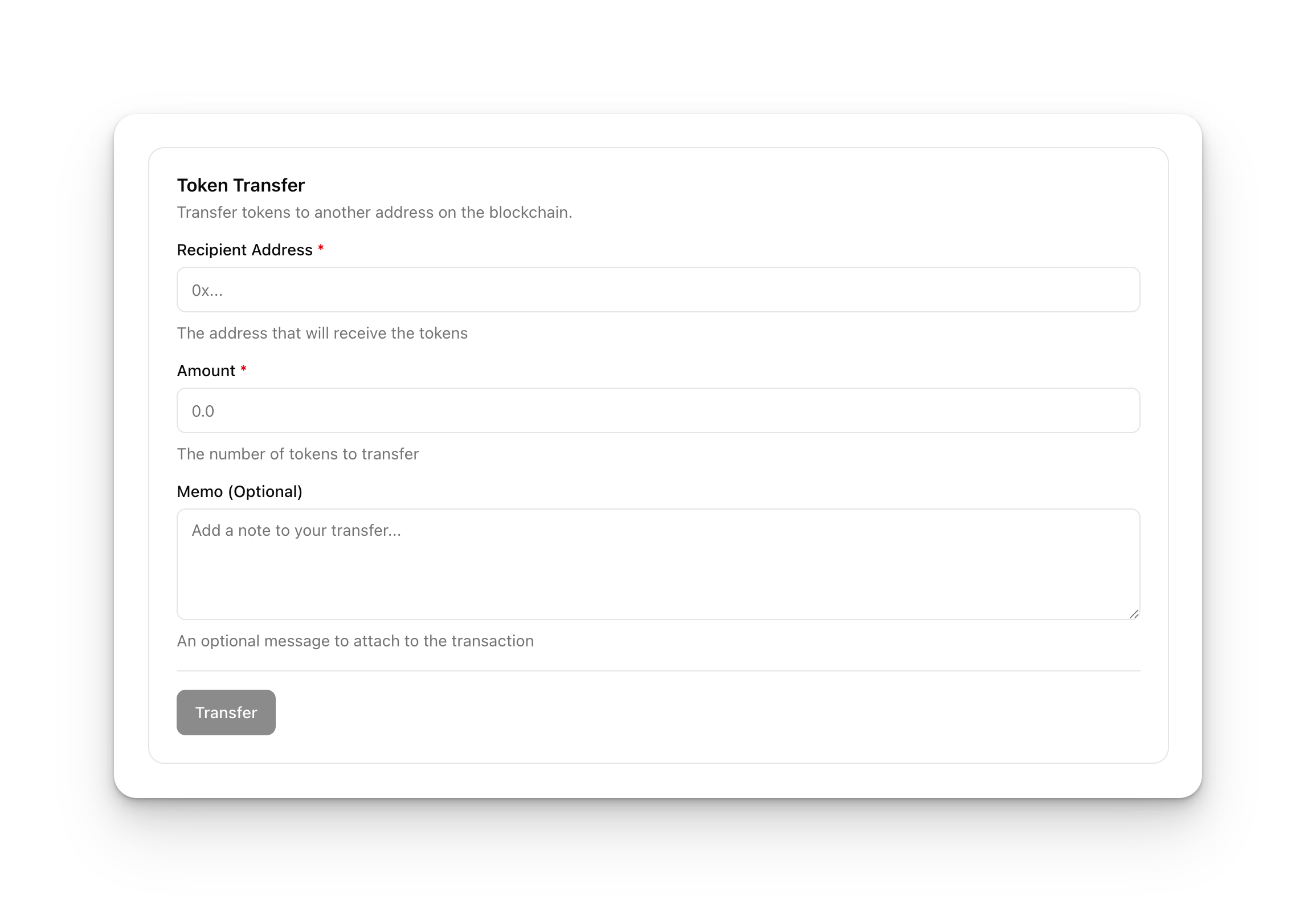
TransactionForm
The primary widget for rendering blockchain transaction forms. Accepts a declarative schema and an adapter capabilities bundle:
import { TransactionForm } from '@openzeppelin/ui-renderer';
import type { RenderFormSchema, TransactionFormCapabilities } from '@openzeppelin/ui-types';

const schema: RenderFormSchema = {
  id: 'approve-form',
  title: 'Approve Spending',
  fields: [
    { id: 'spender', name: 'spender', type: 'address', label: 'Spender' },
    { id: 'amount', name: 'amount', type: 'amount', label: 'Amount' },
  ],
  layout: { columns: 1, spacing: 'normal', labelPosition: 'top' },
  submitButton: { text: 'Approve', loadingText: 'Approving...' },
};

function ApprovePage({ adapter }: { adapter: TransactionFormCapabilities }) {
  return (
    <TransactionForm
      schema={schema}
      adapter={adapter}
      onTransactionSuccess={(result) => console.log('Approved:', result)}
    />
  );
}
Key props:
| Prop | Type | Description |
|---|---|---|
schema | RenderFormSchema | Form layout, fields, and submit button config |
contractSchema | ContractSchema | ABI / function metadata for the target contract |
adapter | TransactionFormCapabilities | Capability bundle from the active runtime |
executionConfig | ExecutionConfig | EOA vs. relayer configuration |
onTransactionSuccess | callback | Fires after successful transaction |
isWalletConnected | boolean | Whether a wallet session is active |
DynamicFormField
Renders individual form fields dynamically based on type configuration. Used internally by TransactionForm but available for custom form layouts:
import { DynamicFormField } from '@openzeppelin/ui-renderer';

<DynamicFormField
  field={{ id: 'amount', name: 'amount', type: 'amount', label: 'Amount' }}
  control={control}
/>
ContractStateWidget
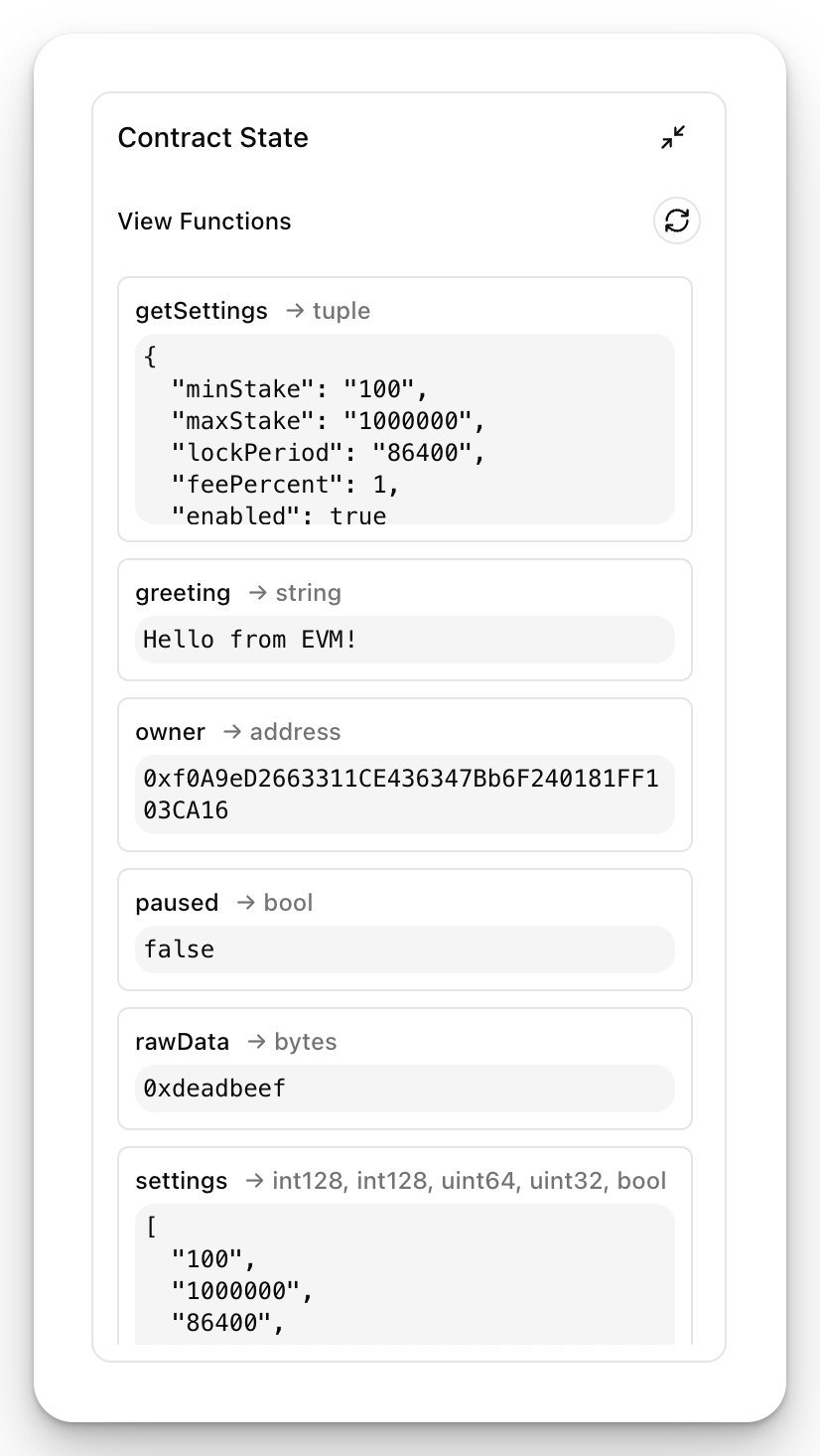
Displays read-only contract state by querying view functions. The widget automatically discovers all view functions from the contract schema and renders their return types. Supports auto-refresh to keep values current.
Each row shows the function name, return type, and live result. No wallet connection is required. Pass query and schema capabilities from the active runtime:
import { ContractStateWidget } from '@openzeppelin/ui-renderer';

<ContractStateWidget
  contractSchema={contractSchema}
  contractAddress="0x..."
  query={runtime.query}
  schema={runtime.schema}
  isVisible={true}
/>
AddressBookWidget
A full-featured address book UI for managing saved addresses and their human-readable aliases. Supports CRUD operations, search, and import/export.
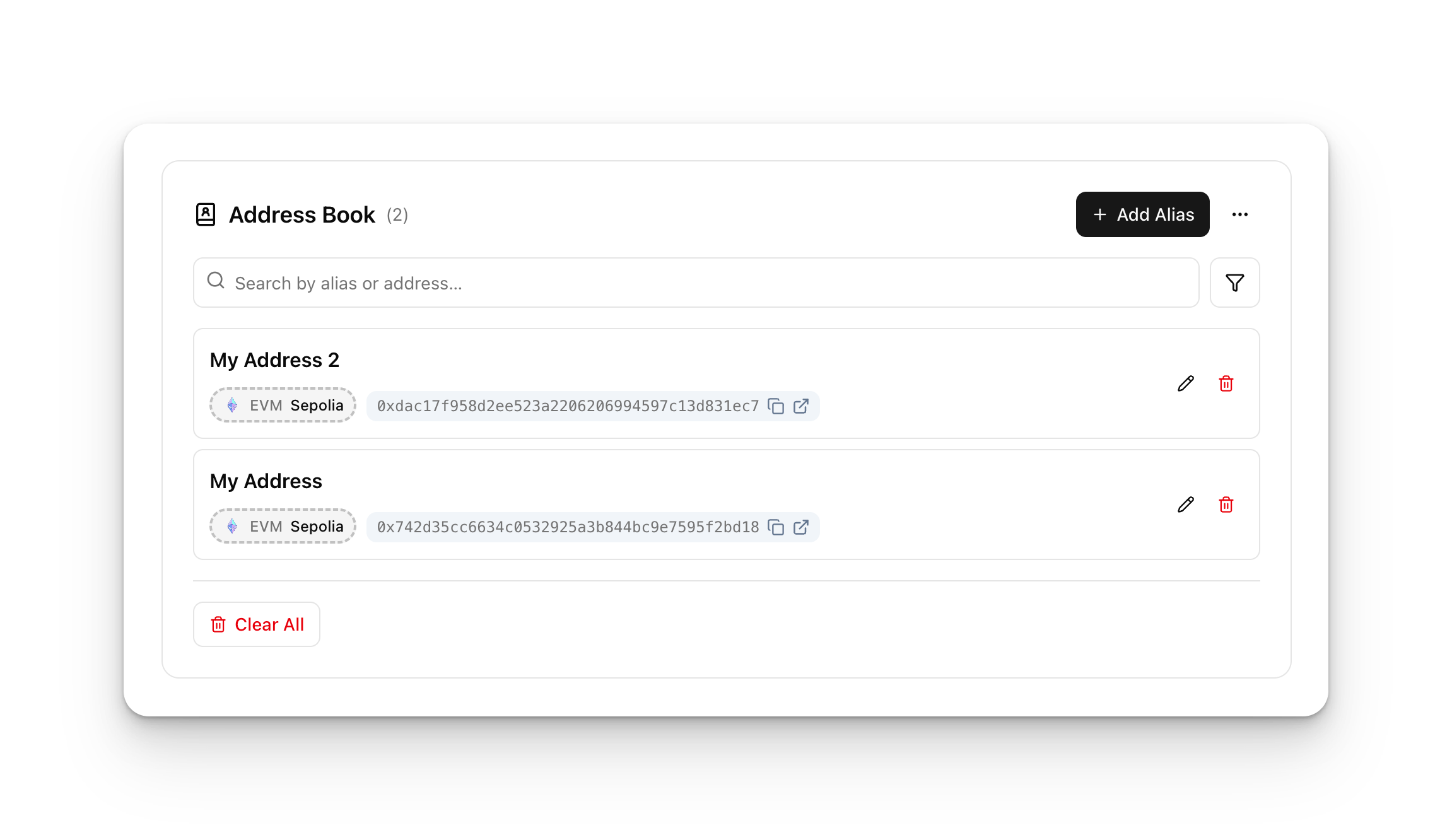
AddressBookWidget works with the @openzeppelin/ui-storage package, specifically the account alias plugin which persists address-to-name mappings in IndexedDB via Dexie.js. When mounted alongside AddressLabelProvider and AddressSuggestionProvider, saved aliases automatically appear in all AddressDisplay and AddressField components throughout the app.
import { AddressBookWidget } from '@openzeppelin/ui-renderer';
import { createDexieDatabase, ALIAS_SCHEMA, useAddressBookWidgetProps } from '@openzeppelin/ui-storage';
import Dexie from 'dexie';

const db = createDexieDatabase(new Dexie('my-app'), ALIAS_SCHEMA);

function AddressBook({ addressing }) {
  const widgetProps = useAddressBookWidgetProps(db, { networkId: 'ethereum-mainnet' });
  return <AddressBookWidget {...widgetProps} addressing={addressing} />;
}
See the Storage page for setup and plugin configuration.
Other Renderer Components
| Component | Description |
|---|---|
ContractActionBar | Network status display with contract state toggle |
ExecutionConfigDisplay | Configure execution method (EOA / Relayer) |
NetworkSettingsDialog | Configure RPC endpoints and indexer URLs |
WalletConnectionWithSettings | Wallet connection UI with integrated settings |
AliasEditPopover | Inline popover for editing address aliases |
Next Steps
- React Integration: Connect components to wallet state and runtime capabilities
- Theming & Styling: Customize the visual appearance
- Getting Started: Step-by-step setup guide